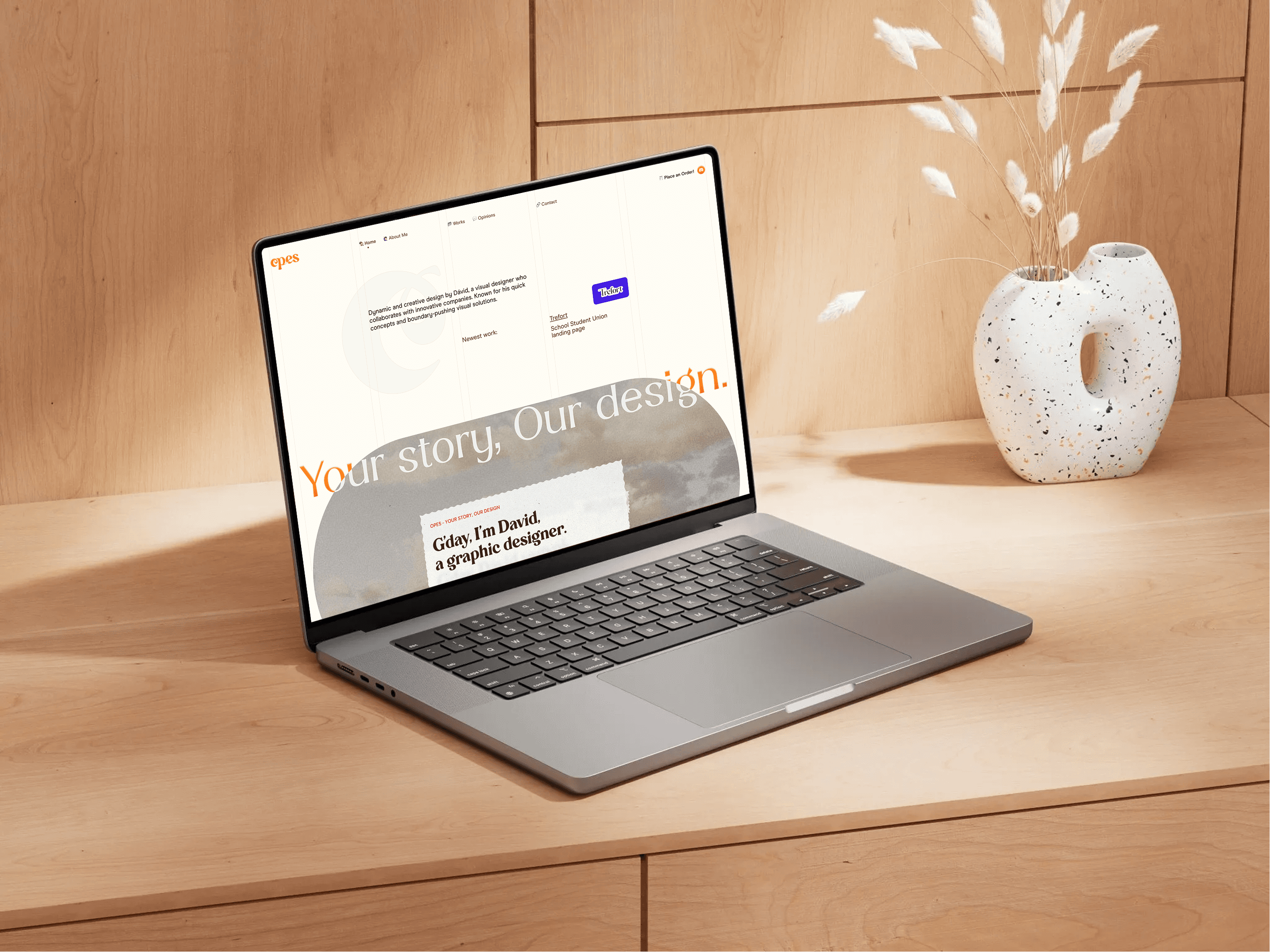
Vero
My Role
Brand & Packaging Designer
Year
2025
Tools Used
Vero
My Role
Brand & Packaging Designer
Year
2025
Tools Used
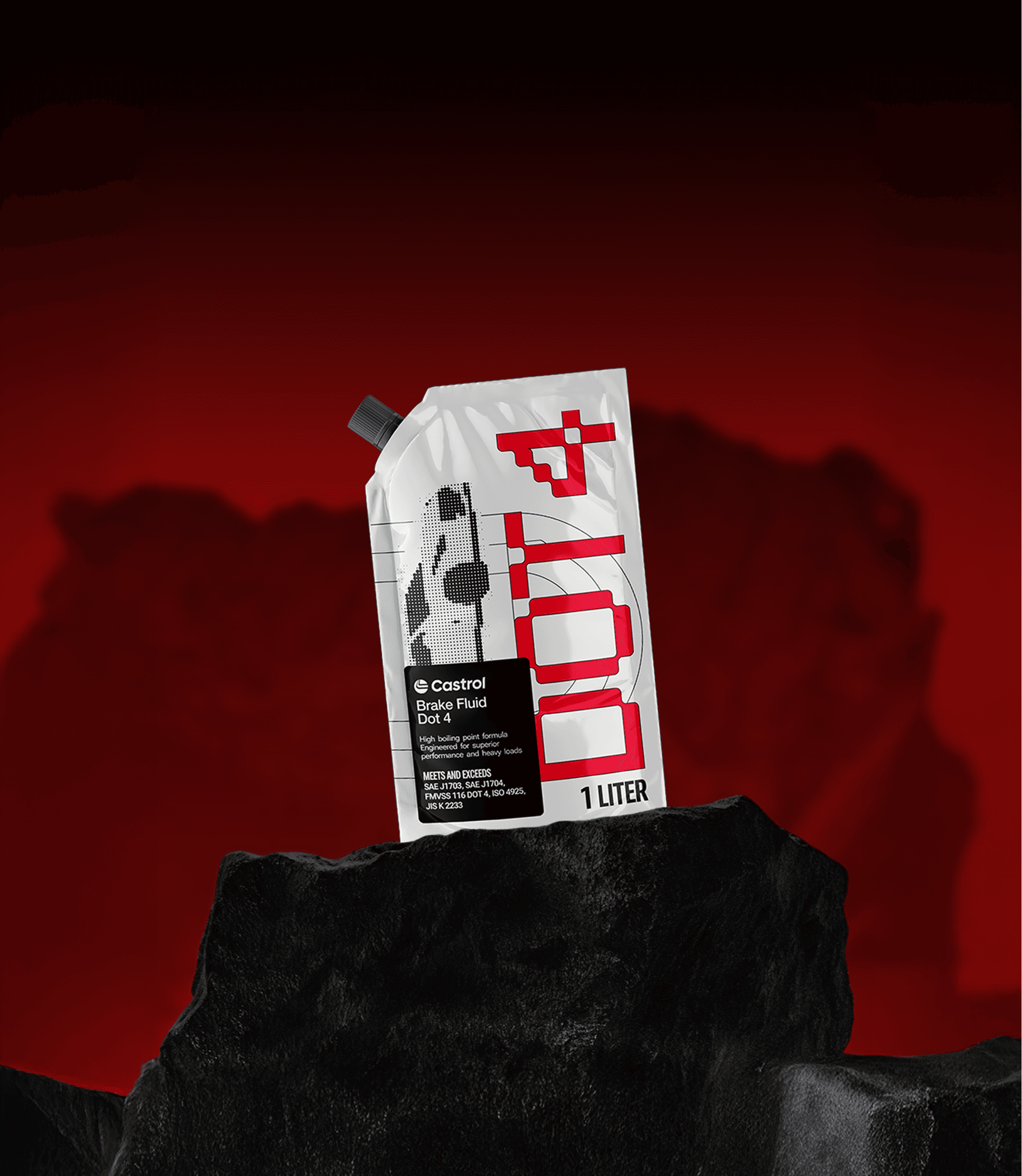
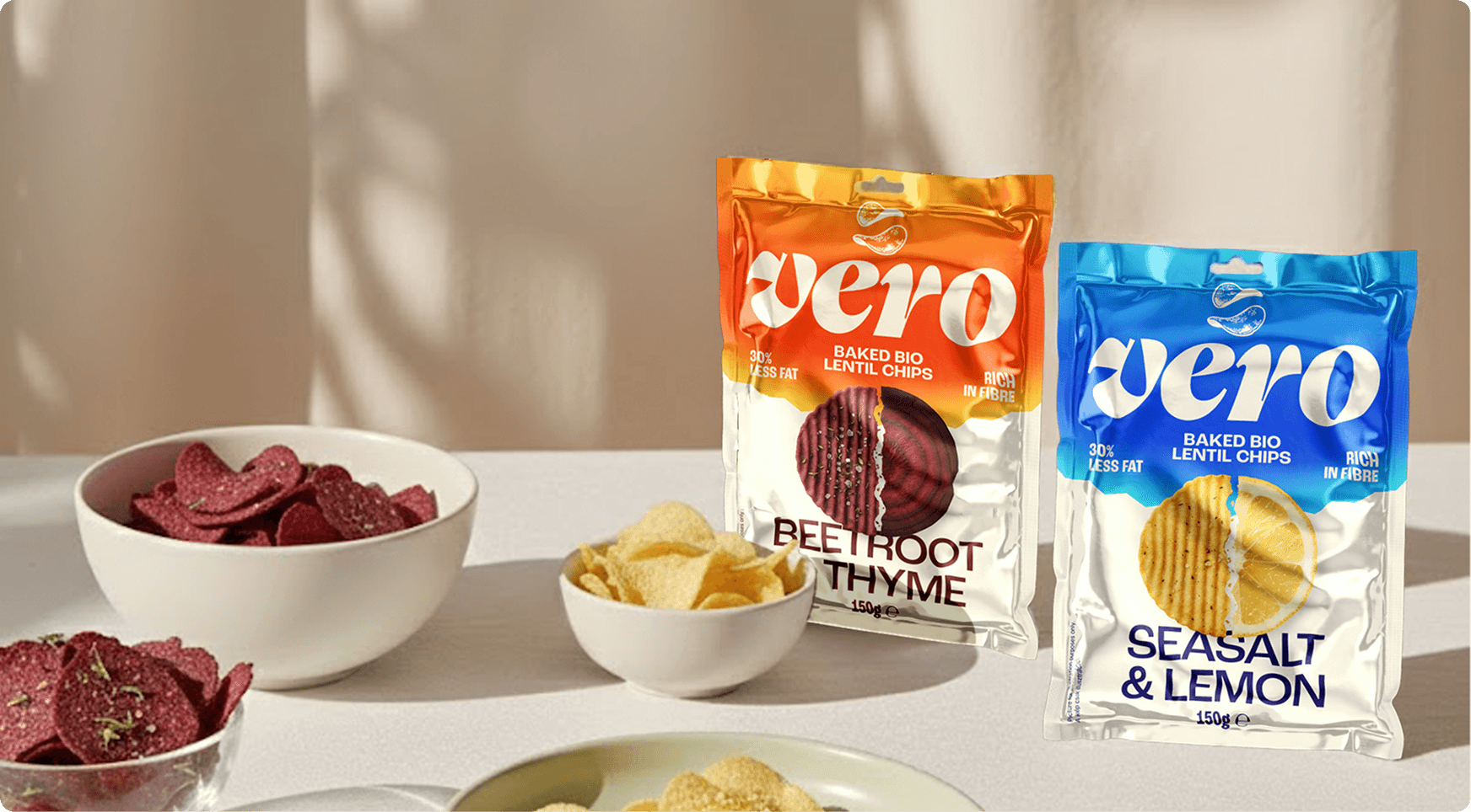
VERO is a fictional brand of baked bio lentil chips designed for a university project. I broke away from the traditional, "earthy" look of organic snacks to create a high-gloss, high-energy visual identity that speaks the language of the digital generation.
VERO is a fictional brand of baked bio lentil chips designed for a university project. I broke away from the traditional, "earthy" look of organic snacks to create a high-gloss, high-energy visual identity that speaks the language of the digital generation.
Challange
Organic snacks almost always fall into the same visual trap: beige colors, kraft paper textures, and a "quiet" aesthetic. For VERO, the goal was to flip this narrative. I had to design a package for healthy lentil chips that feels like a high-voltage energy boost. The challenge was to make "bio" look exciting, premium, and digital-first, moving it from the health-food aisle straight into the hands of a modern, active audience.
Solution
I moved away from natural textures and instead utilized a high-gloss, metallic finish paired with an electric neon color palette. The combination of vibrant blues, sharp oranges, and the gradients create a sense of dynamic movement. By layering the typography with abstract shapes, I transformed a simple bag of lentil chips into a bold lifestyle statement that feels more like it's more than just a traditional snack.
Challange
Organic snacks almost always fall into the same visual trap: beige colors, kraft paper textures, and a "quiet" aesthetic. For VERO, the goal was to flip this narrative. I had to design a package for healthy lentil chips that feels like a high-voltage energy boost. The challenge was to make "bio" look exciting, premium, and digital-first, moving it from the health-food aisle straight into the hands of a modern, active audience.


Solution
I moved away from natural textures and instead utilized a high-gloss, metallic finish paired with an electric neon color palette. The combination of vibrant blues, sharp oranges, and the gradients create a sense of dynamic movement. By layering the typography with abstract shapes, I transformed a simple bag of lentil chips into a bold lifestyle statement that feels more like it's more than just a traditional snack.
Looking for more?