Brake Fluid
My Role
Product Designer
Year
2026
Tools Used

Brake Fluid
My Role
Product Designer
Year
2026
Tools Used
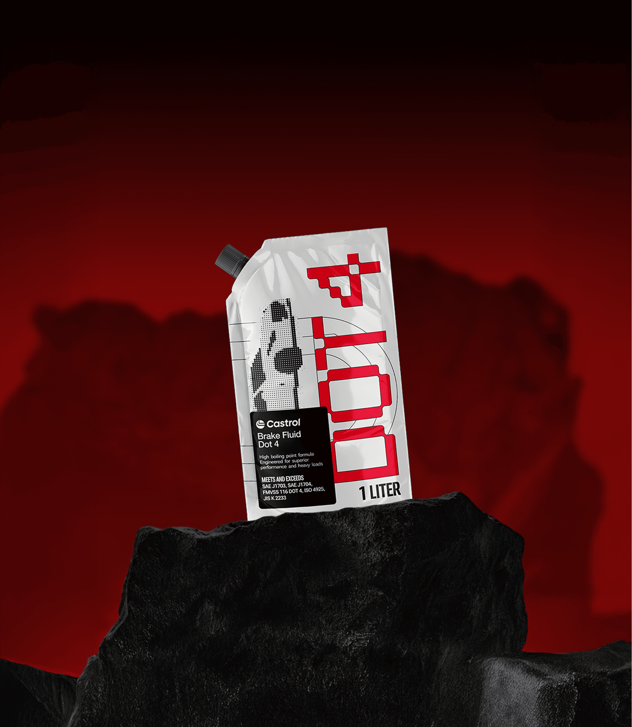
Industrial products rarely focus on premium aesthetics. As a university assignment, I took on the challenge to radically redesign the packaging for Castrol Brake Fluid. The goal was to honor the brand's racing heritage while creating a bottle that looks as high-performance as the vehicles that use it.
Industrial products rarely focus on premium aesthetics. As a university assignment, I took on the challenge to radically redesign the packaging for Castrol Brake Fluid. The goal was to honor the brand's racing heritage while creating a bottle that looks as high-performance as the vehicles that use it.
Challange
Brake fluid packaging is traditionally purely functional, dominating the automotive aisle with bulky, industrial containers. My conceptual challenge was to break through this cluttered, utilitarian look. I aimed to bridge the gap between essential maintenance fluid and a high-performance lifestyle accessory, demanding a total reimagination of the container's form and graphical language without losing core brand recognition.
Solution
I engineered a sleek, aerodynamic bottle design that visually communicates speed and fluidity. While retaining Castrol’s iconic red and green color palette, I applied aggressive, angular graphics and sharp colors to convey raw energy and technical precision. This striking visual system elevates the entire routine of vehicle maintenance, proving how strategic packaging can completely redefine perception in a rigid, traditional market.
Challange
Brake fluid packaging is traditionally purely functional, dominating the automotive aisle with bulky, industrial containers. My conceptual challenge was to break through this cluttered, utilitarian look. I aimed to bridge the gap between essential maintenance fluid and a high-performance lifestyle accessory, demanding a total reimagination of the container's form and graphical language without losing core brand recognition.


Solution
I engineered a sleek, aerodynamic bottle design that visually communicates speed and fluidity. While retaining Castrol’s iconic red and green color palette, I applied aggressive, angular graphics and sharp colors to convey raw energy and technical precision. This striking visual system elevates the entire routine of vehicle maintenance, proving how strategic packaging can completely redefine perception in a rigid, traditional market.
Looking for more?